Background
Medical couriers use this app much like UPS would use their routing and navigation apps. It tells the couriers where to go, if they're on time, and what items they're picking up and dropping off. There are two versions of the app. The legacy version is an iOS app, where the iPhone slides into a scanner device. The next gen version is a Xamarin app, which was used on a phone + scanner combo device.
The Ask
With the move from a custom coded legacy system to the next gen environment, our developers needed to rewrite the entire back end of the scanner application. During that time, I was tasked with making some UX improvements on our existing UI.
Requirements Gathering
The Product team talked to a number of couriers in the test market for the next gen system to get feedback on the legacy scanner app. We had over 1,000 couriers nationwide using this app, so I didn't want to design a completely new UI for the next gen system. My goal was to fix key pain points we know couriers had complained about in the past few years.
Location Comments
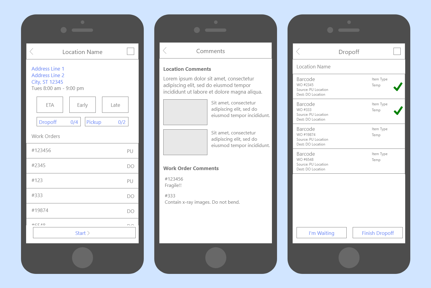
A big part of those complaints were location comments. Location comments would have info about where to park, where an office is located within a large hospital, a photo of the pickup or dropoff area within a location, and even internal hospital maps using the Google Maps API. New couriers would need less time training and existing couriers could easily take over someone's route if they call off sick.
"I'm Waiting"
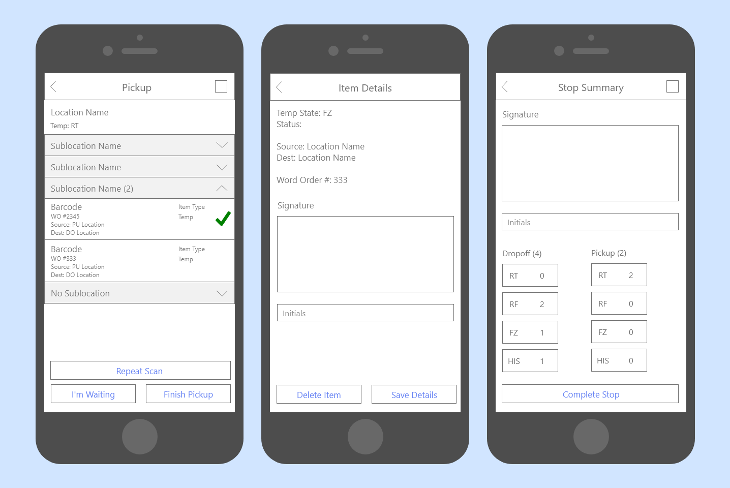
The second biggest complaint was the "I'm waiting" feature. Couriers and business wanted a way to track how long a courier is waiting at the stop for a nurse or technician to pack their pickup items. Working with the Product team, we found that couriers are typically waiting with the Dropoff and Pickup screens open on their devices.
Design


The Future
I'd love a chance to chat one-on-one with the couriers to make even more improvements to the app. Most of them find it pretty intuitive, but there are a lot of workflows that could be cleaned up. The process to "open" a stop and start dropping off items is first on the list, mainly its overabundance of unhelpful error messages.
I'd also look into moving the app's main navigation (not pictured above) to the bottom of the screen. There's a strap across the back of the device that I saw a lot of couriers using as they scan items. Due to the thickness of the phone, their thumbs can't reach to the menu icon in the top left corner of the screen. Moving the nav to the bottom could let them move through the app while they're holding a package or specimen bags.
