The Ask
The marketing page wasn't very inviting or informative. We were asking users to sign up right away before selling them on the product. The business stakeholders were worried the conversion rates for this page would be very low when we rolled it out. UX was pulled in to do a quick redesign before the project wrapped up.
Requirements Gathering
I met with stakeholders and the product manager to find out what features were included in the HR Support Line service. While the service itself was very simple, there were a few features that stakeholders wanted to highlight. They also wanted a focus on people, not just support. This is an HR support service, so we want the potential clients to feel like they can trust the HR support team with any problem they can call with.
Design
(Old design left, new design right)
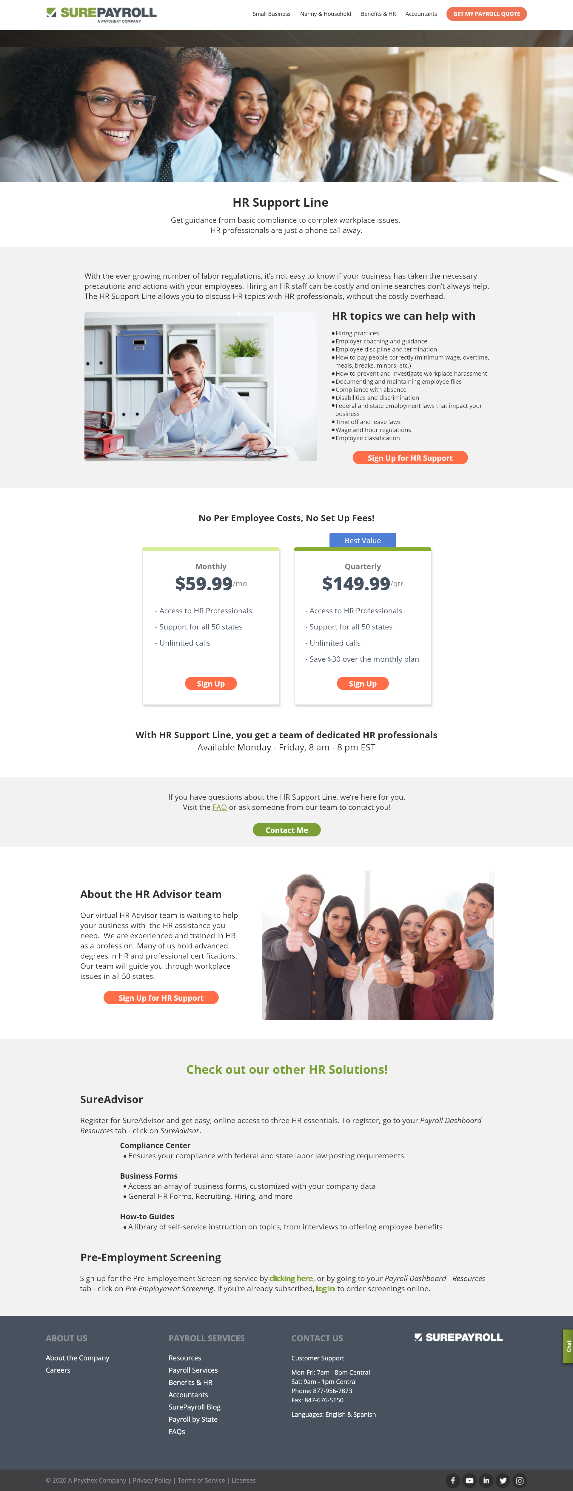
Making the header image smaller gave us more room to include the descriptive text about the service. Removing the form at the top encourages the user to scroll down and read about all the service has to offer before asking them to sign up. I added a bright blue banner to draw attention to the savings the user gets for going with the 3 month package, something that wasn't obvious in the first design.
Because the stakeholders wanted to focus on people, we included a short section describing the HR Advisor team and their qualifications. This will let users know why they should trust the advice and support this service can offer. At the very end, we also include some free options that are already available to them and included links/instructions on where to find those.

Old Design

New Design


The Future
Marketing and business stakeholders were really happy with this design and had great feedback for the UX team. UX and Marketing hadn't previously partnered together in the past on the marketing site, but there are plans for UX to be included in future marketing designs!
